Logo
Our logo elements
There are two elements to our logo, the symbol and logotype. The entire logo is our legal mark and has been registered as such, but we have opted to drop the registered trademark symbol (®) for a cleaner look.
The logotype
Our logotype is a unique font and should always be used as a piece of artwork.
The symbol
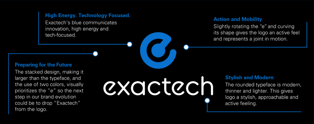
Our symbol is an iconic representation of a moving ball and socket joint in the body as well as a stylized letter “e.” The “e” appears most often as part of the entire logo with the logotype, however, the “e” can be used alone as long as the entire logo is present somewhere in the design.


Applying the “e” symbol
Use it in one color only or multiplied over another color. The preferred color choice is Exactech blue (PMS 285) or reversed in white on solid Exactech blue (PMS 285). Use in solid format or outline.
The full Exactech logo should be present in the layout or somewhere within any Exactech communication. The full “e” graphic is not to be used solely except in the case of use on instrumentation.
Our logo
Primary logo format
The primary logo configuration is this stacked version where the “e” is on top of the logotype. The “e” is larger than typeface, making it visually more important.

Logo size
Never reproduce the logo smaller than 1”, measured using the logotype.

Alternate logo format
If space doesn’t allow for the primary logo format, the alternate logo format may be used. This logo should not be reproduced smaller than 1″ in size, measuring from the symbol to the logotype.

Logo color
The Exactech logo is a two-color logo and should be reproduced in two colors. Under rare circumstances, should the logo be reproduced in one color, either all blue (PMS 285), all white, or all black.
Below are the logo color configurations for black, blue, and gray color backgrounds.

Clear space
- Maintain clear space around the logo to protect it from distracting graphical elements or text. Never allow typography or other elements to “invade” the logo.
- Never redraw or alter the logo, including the placement and size relationship of its letters or symbol.
- Only use authorized artwork from the Creative Services Team.
Sub-brand logos
Our preferred approach to sub-brand logo design is the use of logo type only (no symbols, icons or stylized letters). This makes our Exactech logo visually stand out among our sub-brand logos. At times when a product name is selected that is difficult to trademark, we may opt to use an icon or symbol, but this should be avoided. Our sub-brand logos must adhere to the same standards as our Exactech logo.

